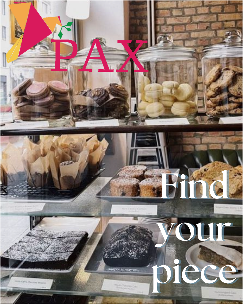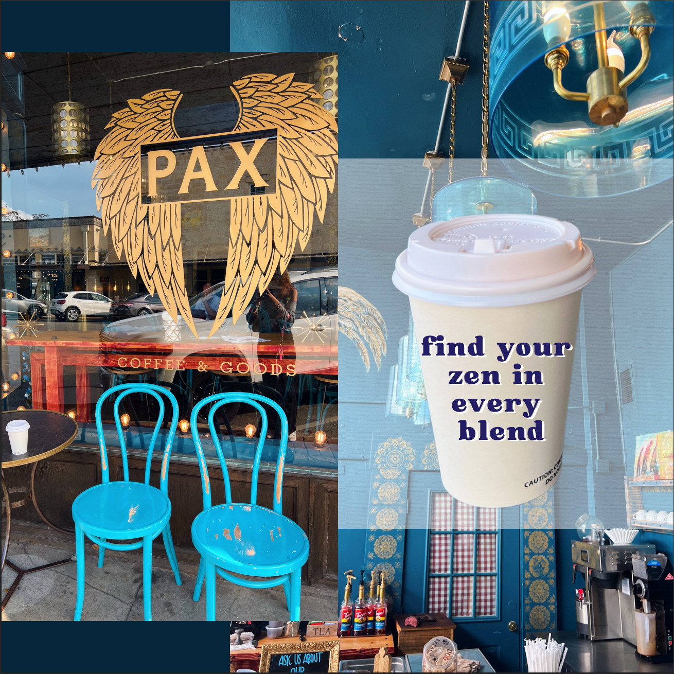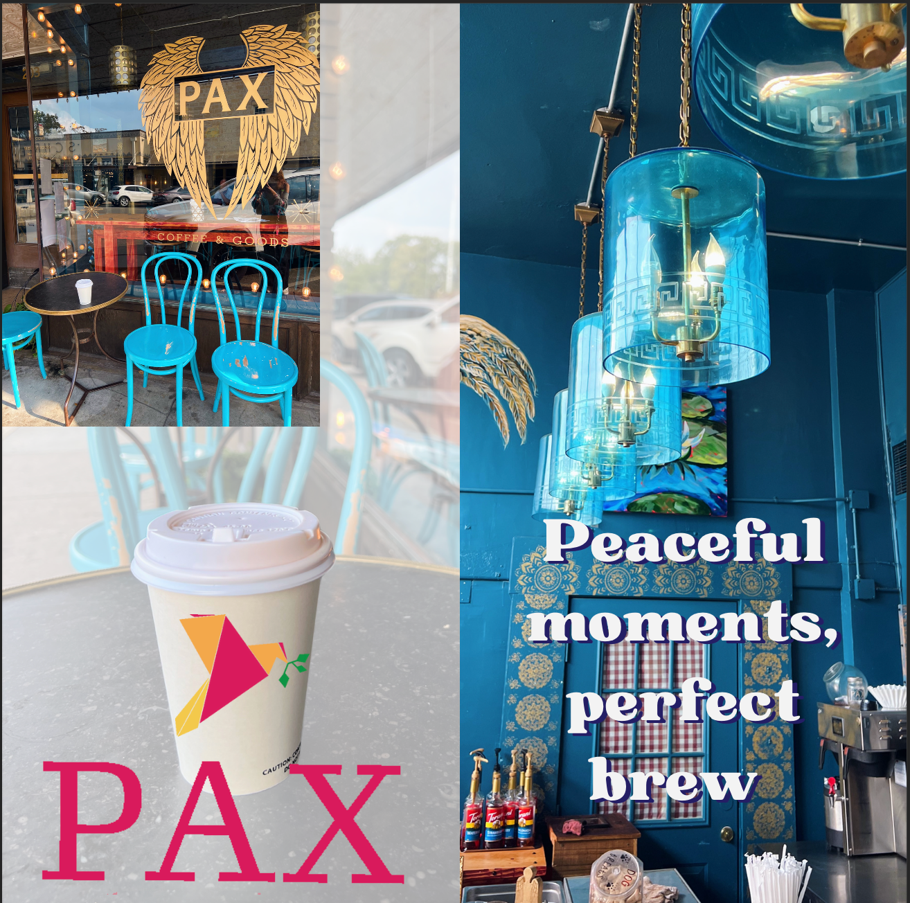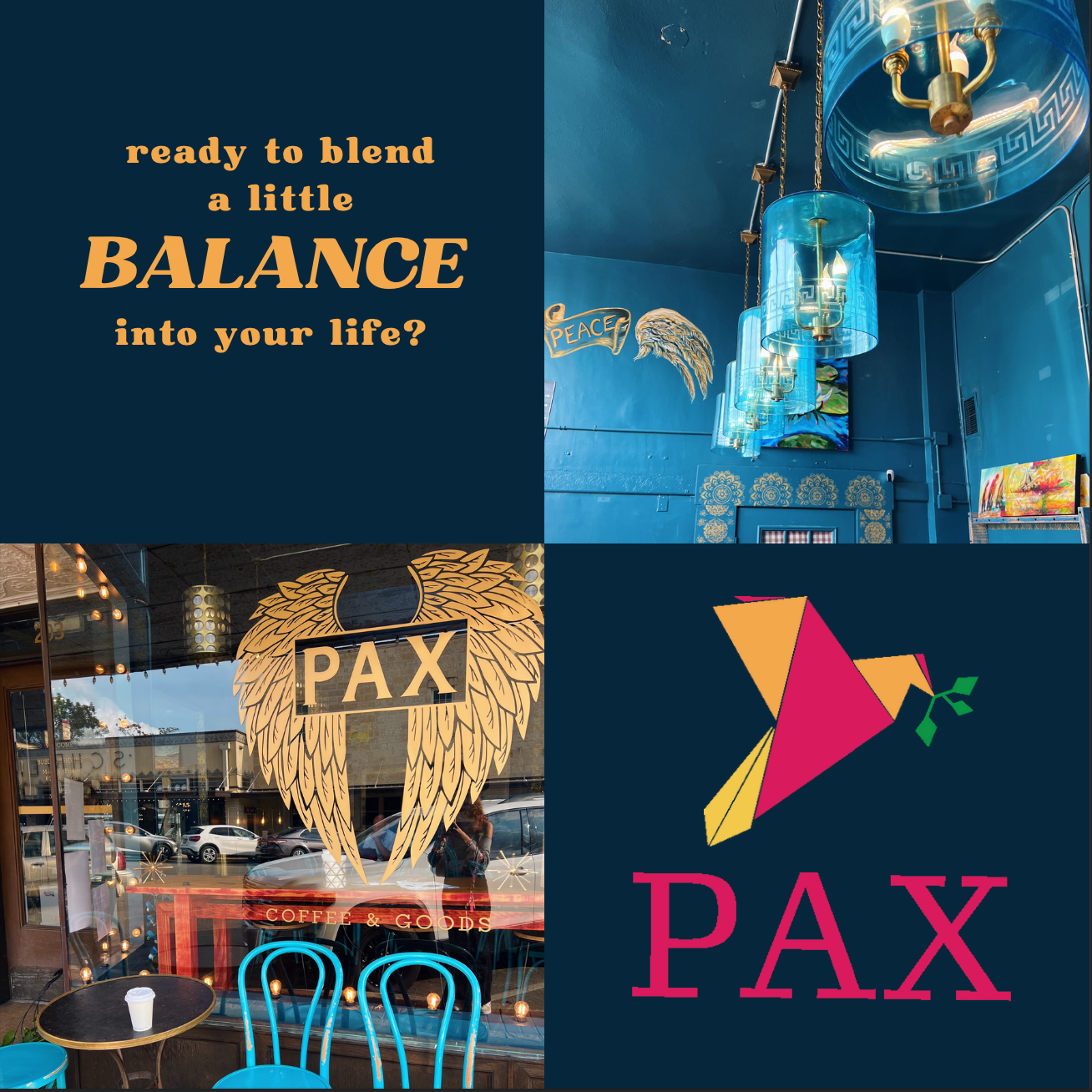
For my redesign of the PAX Coffee Shop logo, I wanted to modernize it and make it more eye-catching. In Latin, pax translates to peace; therefore, I wanted to create a peaceful logo. This is where the idea of the dove came into play. I wanted to give this logo clean lines and a sharpness that the old logo doesn't have, so I created a geometric logo style. I also wanted the color palette to be bright and colorful, therefore, I chose a hot pink, an orange, and a yellow, and to contrast those warm colors, I made the olive branch found in the dove's mouth green.